Novo Nordisk
Healthcare
Challenge
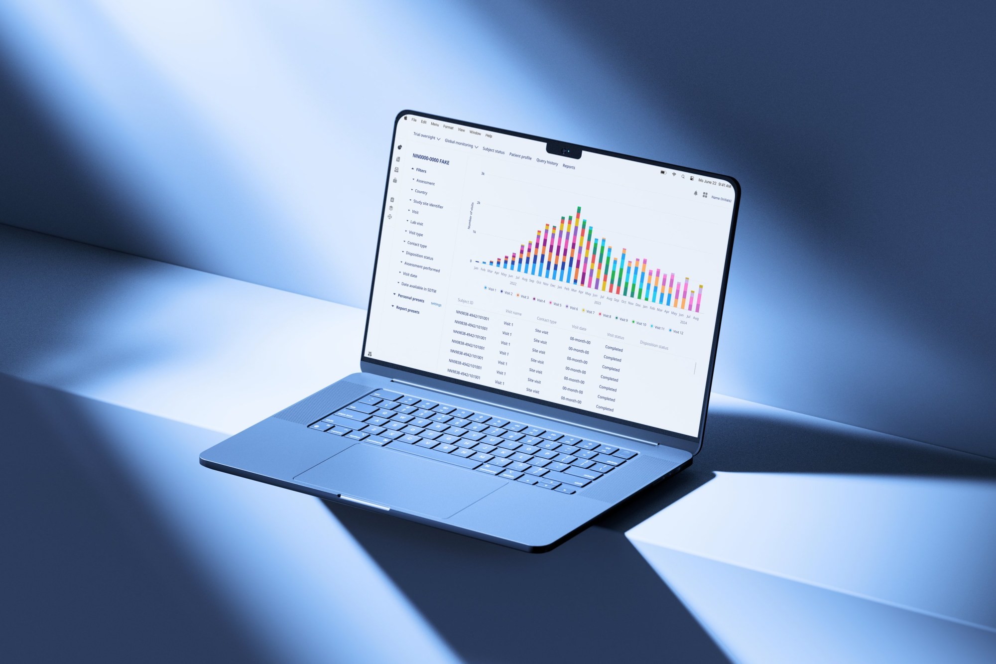
Until now, the only way for the clinical team to ensure patient safety and the effectiveness of a new drug was to identify deviations and anomalies in an Excel file containing thousands of lines.
Identifying discrepancies and outliers is particularly difficult, and errors can easily occur.
Solution
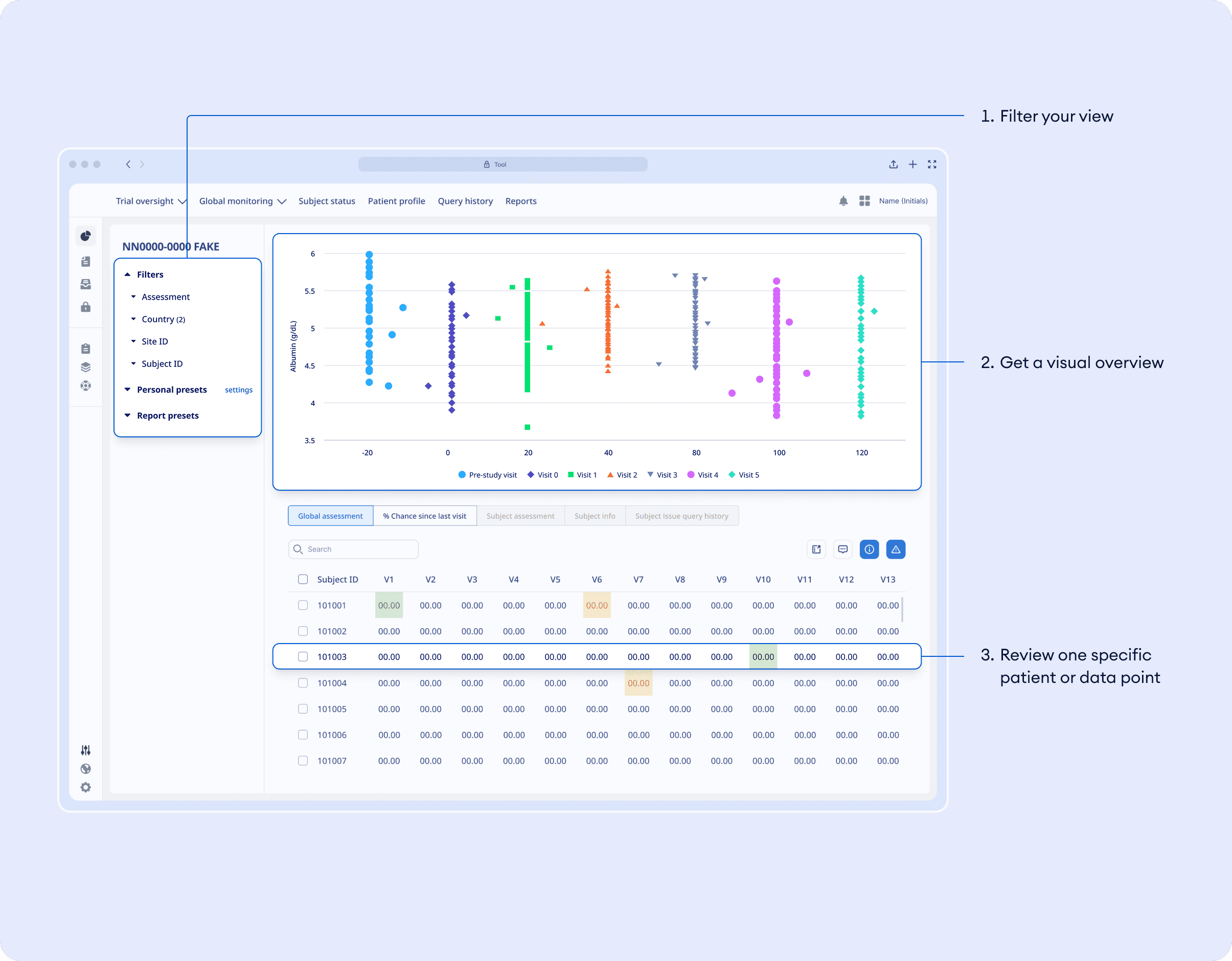
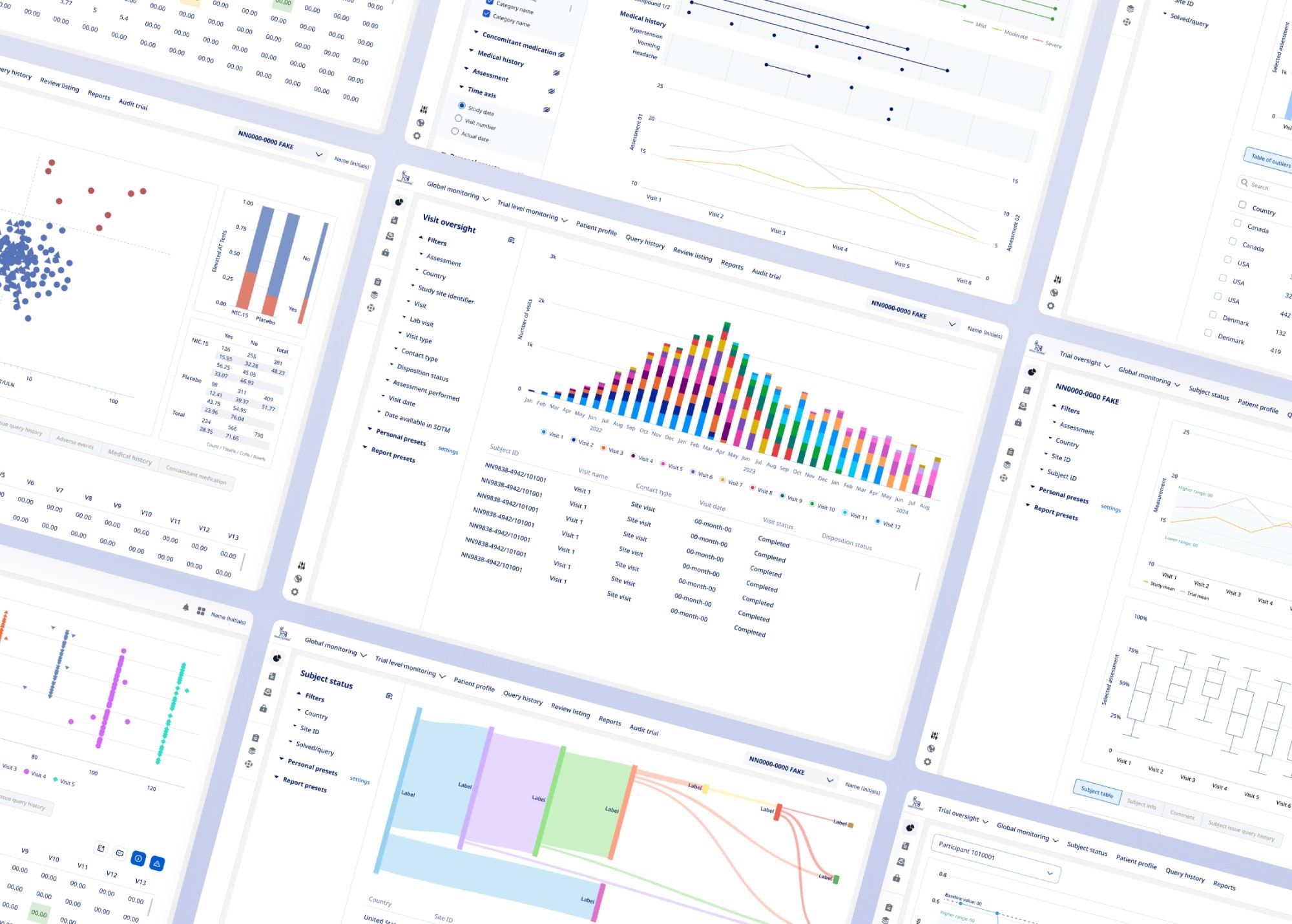
I transformed the experience of the clinical team by designing a seamless, visual and collaborative one-stop-shop for all clinical data review, allowing Data Managers and Medical Reviewers to perform daily checks with improved accuracy.
UX/UI Design
Concept Development
AI
Usability Testing
Visualization
Process
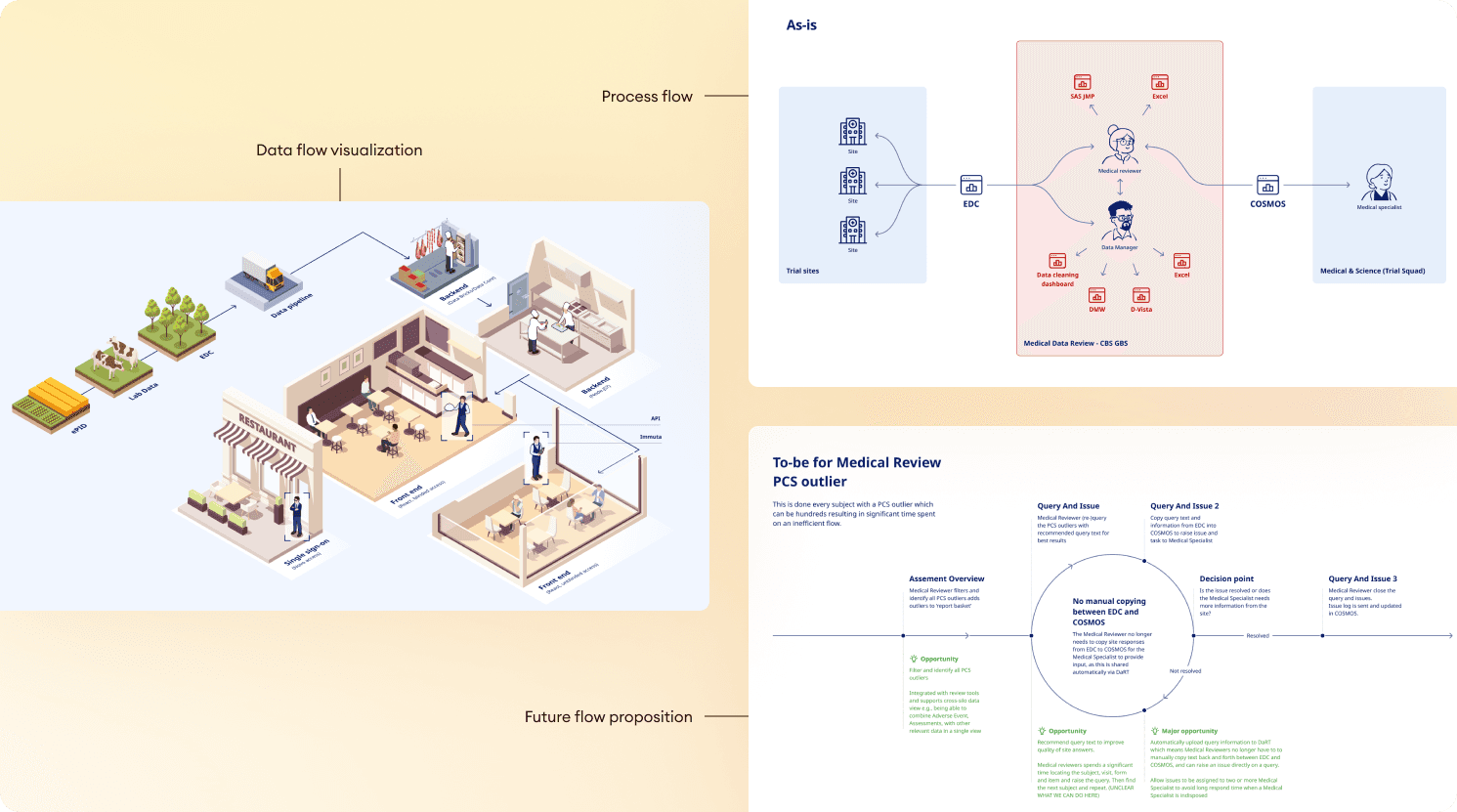
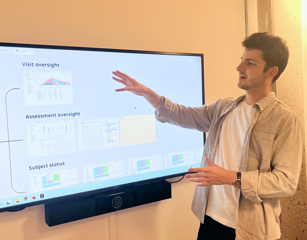
With the help of a Strategic Designer, I began by mapping out the existing ecosystem and immersing myself in the checks and software that scientists use on a daily basis.
I then thought about the best way to categorize these tasks and visually support data comprehension so that no essential information would be overlooked.
Working closely with a front-end developer, we developed a React prototype to test our hypotheses and convince management to begin the transition to a new interface.
Empowered by AI
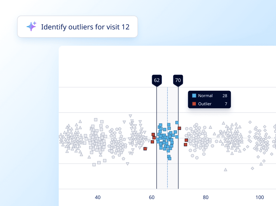
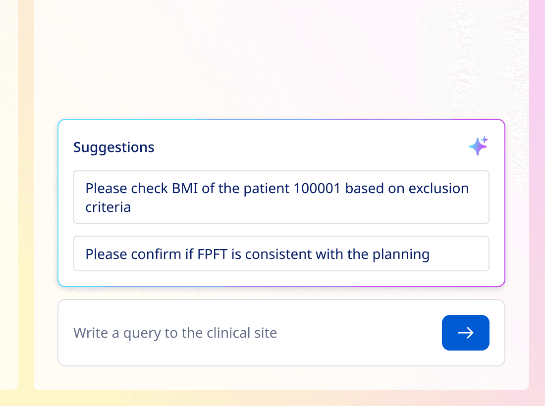
To help users identify special cases, our team of data scientists built an AI to auto-flag deviating points and recommend text for queries.
My role was to think about the best way to visually highlight the content created by AI to increase efficiency and build trust in the data.
Result
After a year of work, this solution was implemented via a Power Platform, and we were able to demonstrate clear interest from users thanks to a number of metrics, such as the number and frequency of tasks performed via the interface, as well as the growing diversity of profiles wishing to use this product.
Clinical trials
Total users
Daily users
Potential new users
time saved performing daily checks
satisfaction (compared to 32% with the previous software)